Watch designers have two main challenges: to create something distinctive from a finite number of elements and to do it with pricing constraints. Though in principle the number of elements is not limited, there are some things that simply don’t make sense – a dodecahedron dial, for instance. From a pricing perspective, a case that looks like a Gehry building would be interesting, but impossible to finish well and sell at, say, $2,000. In other words: not just different for the sake of being different, but with aesthetic and functional reasons, too.
The flip side of the coin is being locked down by a design that’s successful but highly specific: change too many elements and you risk losing continuity with the other watches in the line. There are some surprises here: you can change some proportions more than you might think so long as there are compensations made (e.g. the 17.03 has longer lugs than the 17.01, but a different arc profile to ensure the overall look remains balanced). However, there are some elements where a small change makes an enormous difference: these are to be used with caution.
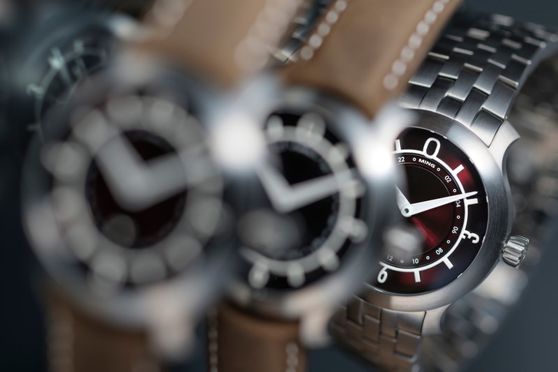
We wanted to make the 17.03 distinctively different from the 17.01 to reflect its different objective: the 17.03 is a more universal, utilitarian tool. Something that requires more robust markings, less shiny bits and an overall bolder aesthetic. (The black one is also probably the closest you’ll get to our interpretation of a pilot’s watch.) Only the cardinal numerals remain, set on a thicker ring with intermediate batons; there’s now a lot more luminous material on hands and sapphire ring so night visibility is greatly improved over 17.01 (for which this was not really a priority).
The GMT function is integrated into the center of the dial as a disk with a luminous shuriken pointer. Together with the radial numbers taking the place of the inner ring of the 17.01, this allows for a clean implementation without requiring an additional hand. It is deliberately not as bold as the main time indication since we still believe you should be able to read your watch at a glance. All of our displays are designed such that the most important indicator is also the boldest, highest contrast and most obvious i.e. you notice the local time first.
Surface finishing matters, too: any watch that is highly polished will naturally appear more delicate, dressier, and less substantial as it reflects the environment around it. Brushed or matte finishes have a heftier, more solid appearance as they distinctly separate from the surroundings. All-matte watches, however, are very difficult to refinish and show blemishes and marks easily; we therefore elected to go with an all-brushed finish.
We also offer a choice of surfaces on the dial: the more playful burgundy has a stronger stamped radial texture to match the color; the more serious black has a sunburst brushing. We elected to forego the digital guilloche on the 17.03; while the liveliness makes it interesting on the 17.01 it also would make it difficult to read the second timezone at a glance on 17.03. Once again, function first.
Finally, a tool watch really needs to have a bracelet – especially one that’s meant to go anywhere and do anything. But as we discovered, designing a good bracelet brings about another set of challenges entirely…to be continued in our next post.
- MT


