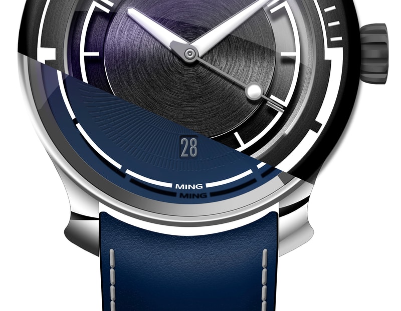
We realize not every detail is obvious at first glance, so this series is intended to provide an inside look into the thought and design process behind our creations – and yes, perhaps a sneak peek or two at the future.

Since day one, I’ve received far too many message asking why I’m allergic to second hands and date windows – so it’s probably about time we set the record straight. I’m allergic to badly executed or designed anything, not just date windows and second hands. I’m also allergic to anything that’s included out of laziness– or not excluded out of indecisiveness. Decoration and aesthetic touches are necessary since the function of a watch is also largely decorative and aesthetic; but incongruous flourishes are not.
But as far as a watch is concerned, the two most difficult things to integrate are the second hand and the date. Why? Because they both have the potential to cause the kind of asymmetry that you cannot unsee, and that can ruin an otherwise balanced design. The second hand moves fast enough that it catches the eye and lands up being an anchor point of sorts; you inevitably follow it around the dial in a way that doesn’t happen with the much slower – and at a glance, static – hour and minute hands. So you’d ideally want it to be not that noticeable, but then if something isn’t noticeable – and thus not legible – why include it at all? This is the main reason we only include second hands on watches that require them functionally; a diver to check at a glance the watch is still running, or a chronograph to measure elapsed time. On everything else– do you really need another reminder of how little time there is in a day, and how many things are vying for your attention?
As far as date indications go, it’s the same problem: you can really only put windows at 6 or 12 to avoid imbalance. 12 is pretty much never done because that’s the one cardinal indication that you must have on a dial to allow orientation and reading of time. You could use a pointer hand, but it moves so slowly that you inevitably land up with imbalance anyway. There’s also the subdial, but you run into legibility problems cramming 31 marks around what is inevitably a very small dial. Or, it just gets busy with a lot of text – unless you have other elements to balance this out, say in on a perpetual calendar –the whole thing lands up feeling crowded in one area only. The only conclusionI’ve been able to come to – other than say a big date window somewhere in the middle 12 area – is a standard single-disc date has to go at 6.
Consideration must also be given to the underlying movement choice and how far exactly the date opening lands up from the center of the dial given the diameter of the date wheel; this isn’t something that can be shifted easily because if the weight of the date wheel changes, there may not be sufficient energy to turn it at all.
Assuming you can find the right movement, we’re back to trying to structure the visual prominence of elements on the dial so the order of reading remains correct:hours and minutes first, date a distant second, then only decorative visual elements. This means lower contrast, and preferably a sort of seamless integration into the pattern of the dial; be that by color or texture or something else. We finally have a watch with a date because it wasn’t easy to get the movement we wanted, and it further took a lot of effort to achieve the desired effect - to the point that it disappears entirely at some angles together with the other complication… MT
Published: September 2022


